We know you have been there. Staring at a photograph that feels a bit flat and wondering what you can do. The color temperature has been corrected and you’ve added some punch with tone adjustments. Yet, it doesn’t quite have the impact you were hoping for.
Color grading is the technique you need to break through this and take your images to the next level.
For many shots it takes some careful adjustments to bring out the best in them. Landscapes, portrait and lifestyle images, food photography. All these and more benefit from some extra attention to color.
Color grading in Lightroom is now a powerful and sophisticated tool.
This article will first introduce you to what color grading is. Then give you everything you need to know to start using the Color Grading tool in Lightroom Classic.
What is color grading?
This term comes up often when discussing cinema, but is also more common in photography now. Yet, many people are not quite sure what it refers to?
Color grading generally refers to color adjustments that go beyond basic color corrections. To color grade a photograph is to enhance and manipulate the colors or introduce new colors.
Color grading is perfect for adding a moody cinematic quality to a photograph. It is about crafting a feel, adding personality and atmosphere.
Specifically in Lightroom, it is a method of adding tones into the highlight, mid-tones and shadows of an image.
Why should I color grade my photographs?
Color Grading is somewhat overlooked or often considered too complex to tackle. It is common to focus on achieving accurate colors and only correcting and enhancing the tones.
Yet, many photographers also reach for Presets to bring a stylish edge to their images. Often the magic ingredient of a good Preset is the use of color grading.
Color grading has several benefits:
- It lets you create unique styles and moods
- It can give your images consistency
- It offers a more sophisticated way of adjusting color temperature
Split Toning versus Color Grading
The Color Grading panel in Lightroom replaces the Split Toning panel of earlier versions.
Split Toning allows you to add colors into the Highlights and Shadows of an image. It was fairly easy to understand and apply.
The Color Grading Panel is a huge upgrade in capabilities. It adds more complexity and controls. You can do a lot more with it, and create very sophisticated color edits.
However, it is also a little more challenging to master.
The good news is that Color Grading is totally compatible with Split Toning. Any images which had Split Toning applied or used Presets with Split Toning will look exactly the same as they did before.
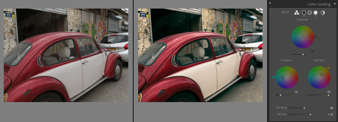
Understanding the Color Grading panel
Lightroom Classic has a dedicated panel for Color Grading. Head to the Develop Module (D) and scroll down the panels on the right and you will find it in the middle.
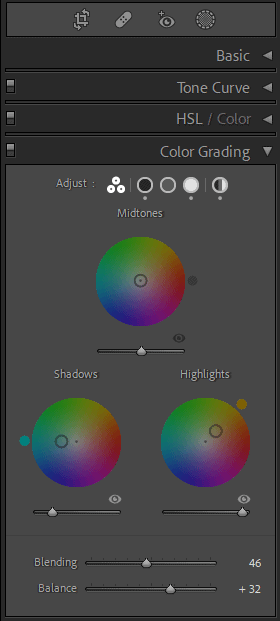
It stands out as it has three color wheels right in the middle.
These three color wheels control the toning of the highlights, mid-tones and shadows separately.
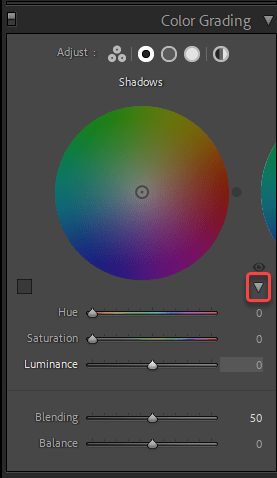
Use the Adjust icons at the top right of the panel to choose what you wish to view. This lets you move from one color wheel to the next. The first icon of three circles shows all the color wheels at once.
The last icon which looks like a circle with stripes shows a global color wheel. Use the global wheel to apply color toning across the entire image at once.
You will have better control when you use the views of the individual color wheels. Do not edit in the three-wheel view.
How to select colors with the color wheel
The simple answer is start to just click anywhere you want on the wheel. The preview in the work area updates dynamically, and lets you test out which colors work best on your image.
The Hue changes according to the direction around the circle. A color is most saturated at the outer edge of the wheel. Moving closer to the center the color becomes less saturated.
There are a couple of ways to control and restrict your selection when it’s time to refine your color choices.
Hold down Ctrl (PC) or Cmd (Mac) to change only the Hue
This will show a circle on the color wheel which corresponds to the Saturation of your current selection. Now move along that arc to adjust the hue. The Saturation remains fixed.
Hold down Shift to adjust Saturation only
With shift held down, you will see a line from the outside of the wheel to the center. Move along that line to keep the same hue, but alter the saturation.
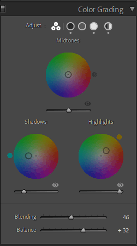
If you ever need to reset a color wheel, double-click on it. This will return it to neutral. Double-click on the word Adjust at the top, to reset the whole panel and start again.
Click on the eye icon next to each color wheel to temporarily turn off the effect for that wheel alone.
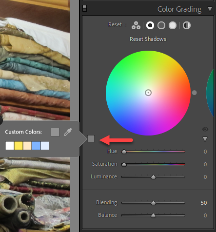
Color Picker and swatches
At the bottom left of the individual color wheels you will see a square color swatch.
Click on it and a little dialogue box opens up. Here you can find the eye dropper tool.
To select a color from your image, click and hold down on the eyedropper. Then move across your photo in the main workspace until you find a color you want to use. Release to make the selection.
You can also select from a few saved swatches here. These are the same colors as were in the old Split Toning panel.
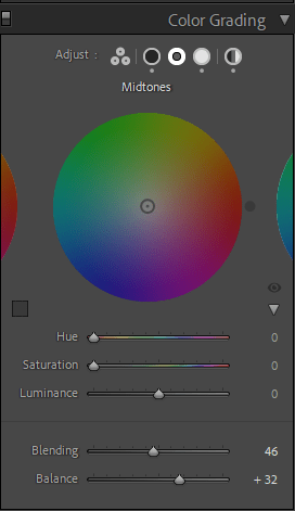
Hue and Saturation sliders
For more precise control, click on the small triangle on the right under any of the individual color wheels. This will reveal the Hue and Saturation sliders.
The sliders are better to control subtle color changes. You can also enter numerical values.
Luminance
Control the lightness or darkness of each tone range using the Luminance slider under each color wheel. This slider is optimized to work in conjunction with the other Color Grading controls. It has a range of 0-100.
Any areas of absolute black and or absolute white will not be affected by the color tints. They will still be black or white.
Use the Luminance slider to bring your blacks up or whites down a little when you want the effect applied to these areas.
Blending and Balance
These are the last two sliders underneath all the color wheels. They adjust the relationship between the colors and how they are applied overall.
There is just one set of these sliders. Even when you adjust these sliders in the individual color wheel views, you are always making changes globally.
Blending controls how much the colors from each tone range mix into each other. The slider goes from 0-100, with 50 being the default and mid-point.
Push it to the right and the colors will blend together into a very smooth transition. If you have color in the mid-tones it will be merged into the highlight and shadow colors and you will no longer see it as a separate color.
At the other end you will be able to see the colors of the three tones very distinctly. Though there is always a little softening, and it will not be a harsh cutoff.
Balance controls the emphasis of the effect on different tones. The slider defaults to 0, and runs from -100 to +100.
Slide to the right to increase the effect in the highlights and reduce it in the shadows. Sliding it to the left and into negative numbers sends the balance in the opposite direction.
How to apply color grading in Lightroom
Now that you are familiar with the layout of the Color Grading panel, let’s look closer at how to actually use it.
There are a lot of elements to control. Which means it can quickly lead to doing too much to your images.
Some quick tips for color grading
1. Always do basic adjustments first
Make sure you have a solid base to work on. Complete color temperature, exposure and tone adjustments before you begin color grading.
2. Start simple
You don’t need to always use three colors. It is perfectly fine to use only a single color wheel. In some cases only adding some coolness into the shadows is enough to create the mood you are after.
3. Select your colors with the saturation set high
With the saturation at 90-100%, you can more easily see the color you are selecting. By default saturation is at zero, so you will have to move the slider or select near the outside of the color wheel.
Once you have a color that works, dial the saturation down to where it enhances, rather than overpowers the image.
Color grading ideas to get you started
A huge part of effective color grading is knowing what colors to pick. Here are some common approaches and suggestions.
1. Warm highlights, cool shadows
This is a classic split toning combination.
Select a warm yellow-orange hue for the highlights. Then pick a cool blue from the opposite side of the color wheel for the shadows. Use the blending to control the balance to suit your photograph.
2. Work with the seasons
Typically you want summer imagery to feel warm and bright. Autumn is all about golden oranges and rich reds. For winter scenes emphasize the feel with cool tones.
The weather and seasons are great references to guide your color choices.
3. What feelings do you want to evoke?
We all have associations that go with color. Work with these to strengthen your images.
Purple says luxury, daring or sophistication. Yellow is happy and fun. Greens and browns imply nature and natural. Red is danger or heat.
Get the most out of color grading
To get the best results from color grading in Lightroom, keep the following in mind:
1. Shoot in RAW
RAW files have the most color information and Lightroom can do a better job of color grading.
2. Learn some color theory
Take the time to brush up on some basic color theory. It will help you make stronger choices.
3. Remember to use other tools in Lightroom
Don’t forget that the Adjustment Brush and the HSL/Color panel are also tools which manipulate color in your images. Use them in combination with the Color Grading panel to perfect your final image.
By now you should feel well equipped to start color grading in Lightroom. Working with color can be a very intuitive and enjoyable process.
All that’s left to do is open some images and start to explore the world of color grading. Once you start there will be no going back.